
You may have been well aware of the notorious Microsoft versions of fonts: Arial the inferior imitation to the classic Helvetica, and Book Antiqua that resembles Palatino – if not, please refer to ARIAL vs HELVETICA and Wikipedia on Palatino. I would like to eradicate Arial from all my delivered works (GhostScript helped a lot). Now, for the ubiquitous TIMES NEW ROMAN, is there anything wrong?
With reference to this article, as Times family is the most prevailing font, there has been a competition among the font vendors to produce the “most refined, sensitive, original, genuine, bona-fide, artistically and typographically correct version. ”, and “the perceived quality of the Times design became a litmus for the quality of several font formats.” To my amazement, there is a statement “both Microsoft and Apple expended a great deal of time and effort to make the TrueType versions as good as, or better than, the PostScript version.” I have not looked into the Apple version of Times New Roman, but for the Microsoft one, I simply cannot believe this is true.
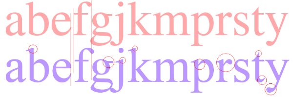
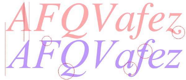
In the following text, Adobe Postscript Type 1 version of TIMES (in red) will be compared the TIMES NEW ROMAN that comes with Windows (in blue).
Let’s look at the upper case first. TIMES is more curvaceous and well proportioned. Notice the circles on B, D, and E. The length of middle bar in F, and the circle in P. Times follows a more classic way of design, which, to me, looks more elegant.

For lower case, notice the flat top of b, d (not shown here), j and k, and the different “f”.
The Italic form of Times New Roman is actually the one that I cannot stand. Look at the inclination of A and F that dwarfs the Tower of Pisa, and the Q walking with slippers. The little tail of “a” is too small while “f” is hunchback. This Italic form simply adds to the ugliness of Mathtype, and can you imagine this immonde font flooding all your formulars and drawings…
The number can also tell a difference, but I’m not too keen on this.

Some of you may argue that this is too trivial and you cannot possible distinguish such a thing unless zoomed on 800%. Believe me, if you are aware of this, you can easily tell while looking at a whole page or paragraph. They simply look different, just like Arial vs Helvetica. TIMES looks more balanced, better proportioned and well-spaced.
Alas, Times is NOT free. But you’ll find some good subsitutes. Convert your PDFs with Ghostscript.
This reminds me of Sheldon…LOL…Is this difference the reason why you can feel the differences between a LaTeX output and a word one, even tho both the fonts are claimed to be "Times xxx", which I just did not understand…Geeee, now I do…
you are crazy….Arial我觉得挺美的阿 = =
Professional look and professional research.
Exactly. This is where the difference lies.